How to stop losing customers to poor navigation
Is poor navigation costing your organisation customers?
Visitors struggling to find their way around your website won’t hang about. Confusing menus and cluttered navigation can turn people off fast, often pushing them into the arms of your competitors.
The harsh truth is very simple: if users can’t find what they want or need quickly, they’ll lose patience and leave.
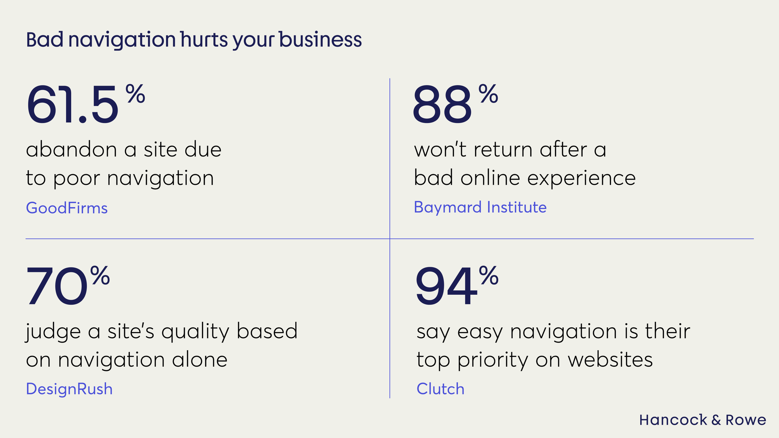
Bad navigation hurts your business
The numbers tell a clear story:
61.5% of users abandon a site due to poor navigation (GoodFirms)
88% won’t return after a bad online experience (Baymard Institute)
70% judge a site's quality based on navigation alone (DesignRush)
94% of users say easy navigation is their top priority on websites (Clutch).
Poor navigation is linked to increased bounce rates and lower time on site,– both critical metrics for engagement and conversions. So when we say bad navigation hurts your business, we mean it. It costs more than just lost clicks – it means lost revenue, diminished brand trust, and a wasted marketing budget.
Don’t let all that time and strategy spent trying to attract visitors to your site be for nothing.
Why website navigation matters
Navigation shouldn’t be considered a technical afterthought, but for what it truly is: the backbone of the whole user experience. When done well, manoeuvring around a site feels effortless. Visitors know exactly where to click next without thinking twice. That smooth journey makes people trust your site more, stick around longer, and come back again.
Plus, good navigation helps search engines understand your site, making it easier for new users to find you in the first place.
At Hancock & Rowe, our philosophy is people-first UX, where a deep understanding of user needs informs each and every design choice.
For the best outcomes for both your business and your customers, navigation should be clear, simple, and written in language your users actually understand.
In exchange, businesses might expect to see:
Increased conversion rates
Reduced bounce rates
Better SEO results
Longer-term visibility and growth.
Five key practices for successful navigation
1. Speak your user’s language
Use clear, familiar labels that say exactly what they mean – that means no jargon and no guessing. Intuitive navigation starts with words your users instantly understand.
2. Keep it simple
Limit your top menu to 5–7 essentials. A flatter, simpler structure keeps people moving without getting lost in endless hierarchies. Less really is more.
3. Stay consistent across devices
Whether they’re on mobile or desktop, users should always find the same clear paths. Mobile-first thinking ensures usability where it matters most.
4. Test with real users
Don’t just launch and hope. Try card sorting, tree testing, or usability sessions with real people from your target audience. Spot confusion early, fix it fast.
5. Measure what matters
Even small improvements in navigation can spark major gains. Our Counselling Tutor project saw conversions climb 103% and call-to-action engagement rise 110%.

Understanding user behaviour to drive your navigation
Building a successful site navigation starts with having a deep understanding of your users.
Our User Behaviour Audit dives into analytics, heatmaps, session recordings, and direct user feedback to reveal where users hesitate, what paths they follow, and where frustration builds.
Understanding actual behaviours – not assumptions – lets us craft navigation that aligns perfectly with user intent, reducing drop-offs and creating smoother journeys.
Find out more about our User Behaviour Audit, including real business results.
How satisfied users drive growth
User satisfaction thrives on ease and predictability. When users can find what they want quickly, the chance is they’ll be back for more. Our data consistently shows that organisations who invest in their site navigation benefit from:
Higher session durations
Increased page views and product discovery
Lower bounce rates
Better conversion rates and revenue growth.
The key point here is that navigation isn’t merely a luxury UX feature; it’s one of the biggest drivers for growth we see.
Final thoughts
Navigation isn’t just about menus and labels – it’s about whether your users stay or go. A site that’s easy to move through builds trust, creates loyal customers, and unlocks measurable growth. A site that’s confusing does the opposite – draining away the very people you’ve worked so hard to attract.
If you want to stop losing customers to poor navigation, start by putting users first in every design choice. Speak their language, keep things simple, test with real people, and let data guide your improvements. Do that consistently, and you won’t just fix frustration – you’ll turn navigation into a competitive advantage for your business.
Ready to stop losing customers to poor navigation?
Discover The Navigation Optimiser now and see how we can help you turn more visitors into paying customers.
Alternatively, book in a FREE 30 minute session with our UX Director, Jason Hancock.